
Which city has the most diverse food? It depends how you count.
44 cities, 200,000 restaurants. Toronto has the most even spread, London the widest, and Rome is 81 percent Italian.
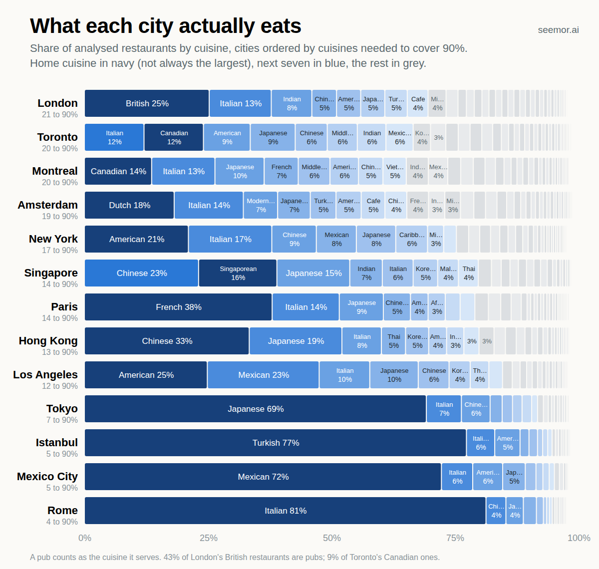
Back in June I wrote about which cuisines conquered the world. Italian won, by a lot. Many people wrote in to tell me what I'd gotten wrong about their country, which was actually pretty fun. One comment got put on my to-do list: "Fascinating Ryan! I wonder what cities in the world have the most diverse cuisine distribution?"
I figured this would be a straightforward weekend project. Seemor has now analysed around 450,000 restaurants across 71 countries, with another 2 million mapped. And we've put a lot of work into understanding what each restaurant actually serves, rather than relying on the often-incomplete (and sometimes downright wrong) cuisine labels in Google Maps and other directories.
So I had the data. All I needed to do was count the cuisines in each city, sort the list, and I'd have my answer.
The counting was easy. London 60 distinct cuisines, New York 58, Paris 58, Berlin 56, Toronto 55, Chicago 54, Tokyo 53, Rome 46.
That felt too simple though and the results didn't feel right. Paris tied for second? Tokyo not far behind? Rome level with Mexico City? The problem is that the count mostly tracks how big a city is. Somewhere in any big city there's an Ethiopian place and a Georgian place and a Laotian place, and each adds one cuisine to the tally, the same as the 4,900 French restaurants in Paris do.
The more interesting thing is the distribution. Paris has a restaurant for almost anything, but Paris is also 38 percent French. Tokyo has 53 cuisines but is 69 percent Japanese. Rome has 46 but is 81 percent Italian.
So there are really two questions. Can you find it in the city? And how much of the city is it? London, Paris and New York have the most distinct cuisines by count; you can find most any cuisine somewhere in these cities. The second question needed a different measure and there are a few ways to do it.
The simplest is the share of the city taken by its biggest cuisine. Rome 81 percent, Tokyo 69, Paris 38, London 25, Toronto 12. You could say that the larger the top cuisine is as a share of total restaurants, the less diverse the city is. But that ignores everything below first place. Two cities could each have 60 percent of their restaurants serving one cuisine, while the remaining 40 percent is either another single cuisine or twenty different ones. Those are very different restaurant scenes.
The measure I found most useful is: how many cuisines do you need before you've covered 90 percent of a city's restaurants? In Rome, 4. Tokyo 7, Paris 14, Amsterdam 19, Toronto and Montreal 20, London 21. (The appendix has an additional measure, borrowed from ecology, which tells a similar story.)
The measures don't agree on a winner, which I find interesting in itself. London has the most cuisines and needs the most of them to reach 90 percent. Toronto has the smallest top cuisine of any city, with Montreal right behind. London's biggest cuisine is twice the size of Toronto's. So: where do the most cuisines have a real presence? London. Where is no cuisine in charge? Toronto.
What each city actually eats
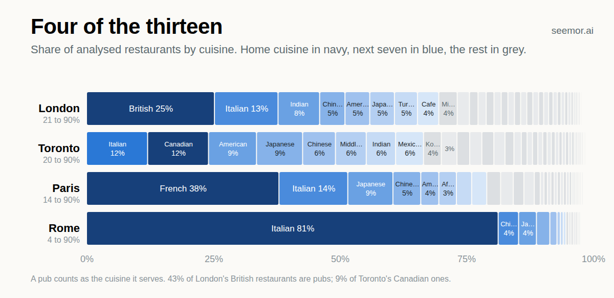
The chart at the top of this piece has thirteen cities; these are four of them. Each bar is a whole city, with the home cuisine in dark navy, the next seven in blue and every smaller cuisine its own grey slice. The long grey tail on London and Toronto is dozens of cuisines too small to label. Notice that Rome doesn't have much of a tail.
Toronto has no top cuisine. Italian is 12.1 percent of the city and Canadian is 12.0. Then American, Japanese and Chinese, each a little smaller than the last.
Montreal is similar, with Canadian just ahead of Italian. French is fourth at 7 percent. In Vancouver the biggest cuisine is Japanese.
That makes Canada unusual. In almost every other country, the home cuisine is the biggest one in every city we looked at. The only exception is Germany, where Berlin and Munich both have slightly more Italian restaurants than German ones.
One caveat: Toronto's top spot depends on treating Canadian as its own cuisine. Fold it into American and Toronto drops to fourth on the 90 percent measure, with Amsterdam the most even city. (What "Canadian" means in our data is in the appendix.)
Paris and London have nearly the same breadth and look nothing alike. Paris is 38 percent French, and Italian is a clear second place at 14 percent. London's biggest cuisine is British at 25 percent, and 43 percent of those are pubs. (Why pubs count as British, and why sushi and ramen are both Japanese, is in the appendix.)
After British come Italian, Indian, Chinese, American, Japanese and Turkish, each big enough to see on the chart before the grey tail starts. Paris has a bit of almost everything alongside a lot of French. London has a lot of several things.
Rome, Tokyo, and the impact of a single major cuisine
Rome is 81 percent Italian, Istanbul 77 percent Turkish, Mexico City 72 percent Mexican, Tokyo 69 percent Japanese. These cities sit at the bottom of every diversity measure (though, per the note above, there is tremendous diversity within these cuisines, especially in their home cities).
I thought I had a good explanation for Rome: the local food is so good that a foreign restaurant has to be excellent to survive there.
We have food-quality scores for the restaurants we've analysed in depth, so this was easy to check and it was wrong. In Rome the non-Italian ones score slightly lower than the Italian ones, 7.5 against 7.8 out of 10, and they're no more tourist-facing. This is the opposite of what my theory would have shown, and I don't have a great alternative theory. It could just be that even Romans need a break from Italian every once in a while and don't necessarily differentiate between good vs great within other cuisines? It probably helps that Italian is the most prolific restaurant cuisine in the world per our earlier analysis.
The cities at the bottom of the chart are mostly the capitals of cuisines the whole world has adopted: Italian, Japanese, Mexican, Turkish, Thai, Indian. Visitors come for the local food and locals seem to like it as well. This can't be the whole story though; Athens and Lisbon are nearly as home-heavy with cuisines that don't have much of an international footprint.
One interesting thing did turn up. Take the Italian restaurants away and the 19 percent that's left needs 18 cuisines to reach 90 percent of itself, about the same as London's remainder. Rome's non-Italian restaurant scene is diverse. It's just small next to the Italian one.
Tokyo's 69 percent is a different story. "Japanese" is one word for sushi, ramen, izakaya, yakitori, tonkatsu and soba. "Indian" is one word for the Punjabi, Gujarati, South Indian and Bengali places that make up two-thirds of Delhi, Mumbai and Bengaluru. The same goes for Italian in Rome and American in Chicago. A national cuisine is a coarse unit. The bottom of the chart measures how much of a city belongs to one of them, and says nothing about the variety inside, which in a city that's 70 or 80 percent one cuisine is where most of the variety lives. We do have data on the sub-cuisines and may use them in a future analysis.
But why? It's not density
Once I had a diversity number for every city, I wanted to see what it went with. My guess was density. I expected the densest cities to be the most diverse: more restaurants packed onto each block, more reason for each one to find a niche nobody else has.
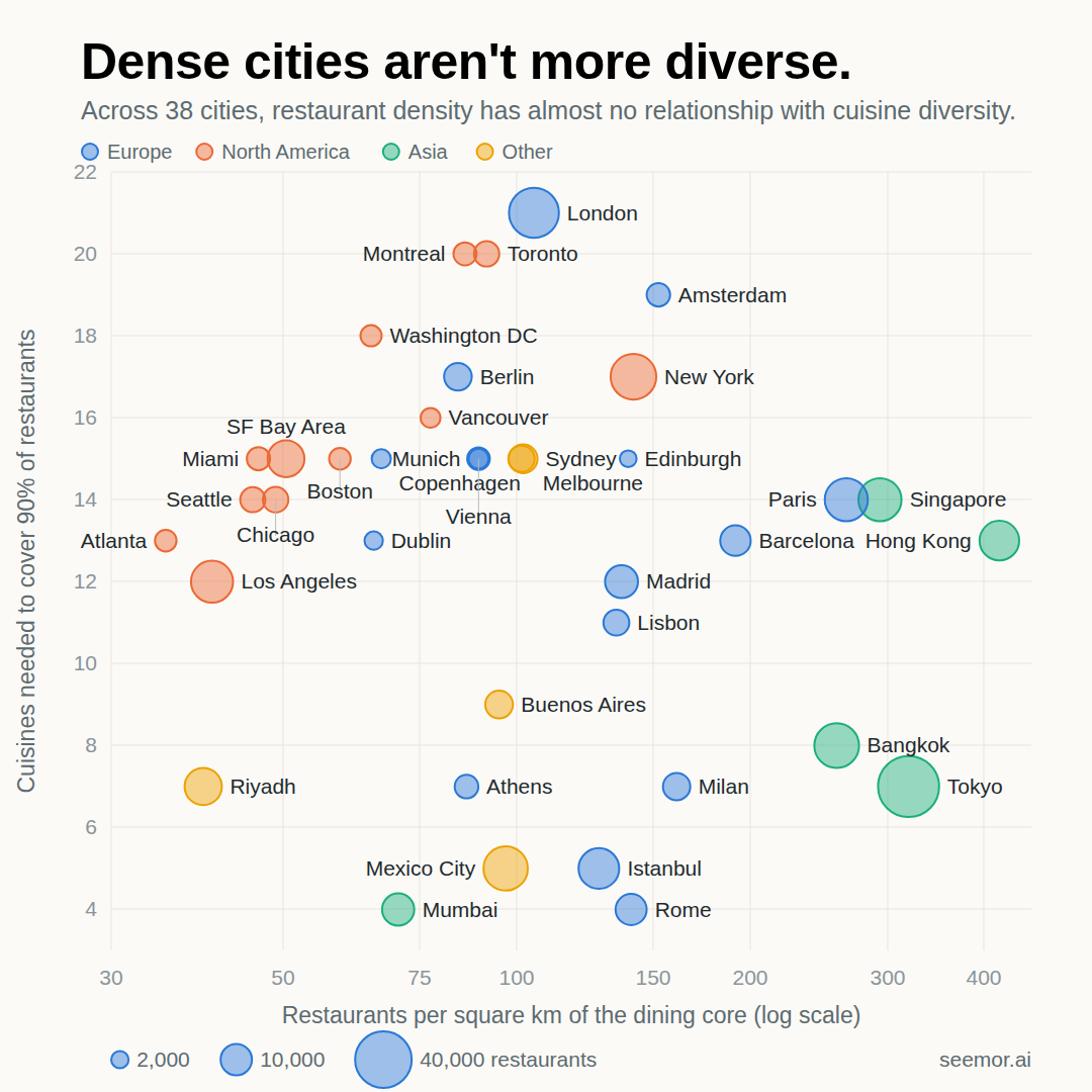
Density here is restaurants per square kilometre in the core of each city, so suburbs don't count against it. Hong Kong is the densest at over 400, then Tokyo, Singapore, Paris and Bangkok. The colours show where the cities are, and that's the pattern that does jump out. The American cities are spread thin on the left. The Asian cities are dense and, Singapore and Hong Kong aside, sit low. The diverse cluster in the middle is European, Canadian and Australian.
I couldn't find a relationship. The correlation is close to zero however I define density, and stays there if I drop the five densest cities or swap in a different diversity measure. Within North America there's a hint of one, with the thin-spread cities like Atlanta and Seattle less diverse than New York and Toronto, but Europe runs the other way and the two cancel out. What the chart does show is an empty top right corner: no city in our data is both very dense and very diverse. Amsterdam comes closest, and Singapore is the only very dense city that's even mid-table. The dense cities are mostly Asian, and they're the ones where a single national cuisine hides the most variety, so I'd read that corner with the Tokyo caveat in mind. I'd have liked density to explain something. It doesn't, at least not in this data.
Immigration is a big reason
The other obvious explanation is immigration, and the top of the chart reads like a list of the world's big immigrant cities. Nearly half of Toronto's residents are immigrants (!!), according to the 2021 census, and London, Sydney, New York and Montreal all fall between a third and two-fifths. The Turkish and Vietnamese slices in Berlin, the Caribbean slices in New York and Toronto, the Indian slice in London, are the migration stories from the earlier article showing up at city level.
So I pulled the share of residents born abroad for the same cities as the density chart, 36 of the 44 with an official figure, and put it against the diversity number.
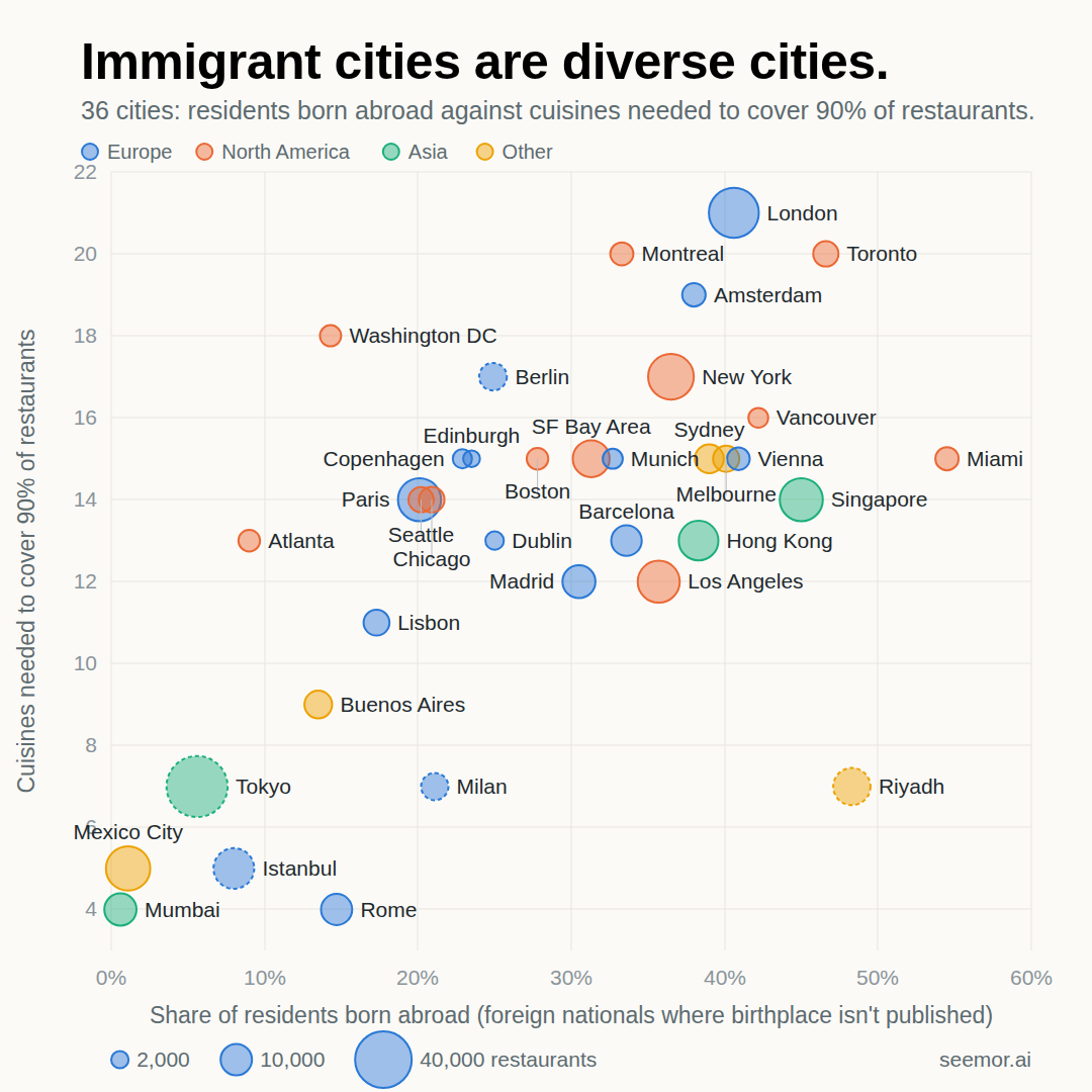
This one worked. The rank correlation is 0.54, against roughly zero for density, and every ten points of foreign-born share is worth about two more cuisines. Mexico City and Mumbai have almost no immigrants and almost no spread. Toronto, London, Vancouver and Amsterdam have a lot of both.
The cities off the line are the interesting ones, and they share a pattern: where the immigrants came from matters as much as how many there are. Riyadh is nearly half foreign nationals and still only has seven cuisines, because its foreign population is overwhelmingly South Asian and Arab workers. Miami is 55 percent foreign-born and manages 15, with most of its immigrants from Cuba, Venezuela, Colombia and Haiti. Buenos Aires has the same foreign-born share as Rome, and its immigrants mostly came from Paraguay, Bolivia and Venezuela, whose food is a cousin of Argentine food. Immigrants from one region bring one cuisine. Toronto's came from everywhere.
Washington DC goes the other way, 14 percent foreign-born and 18 cuisines. I suspect that's our city boundary taking in the suburbs, where the share is much higher.
I also thought I'd found something in the size of the home cuisine. In the broad cities it's small: Toronto 12 percent, Vancouver 15, Berlin 17, Amsterdam 18. In the narrow ones it's enormous. Then I realised it's mostly arithmetic. If the home cuisine is 81 percent of the city, the other 19 percent can't need many cuisines to fill. There's a weaker real pattern underneath, which is that cities with a small home cuisine also spread everything else more evenly, but whether that's because Canadians and Germans don't go out for their own food, or because the same history that keeps the home share small also brings the other cuisines in, I can't tell.
So, to the original question, what are the cities with the most cuisine diversity?
If diversity means the most cuisines with a real presence, it's:
- London
- Toronto
- Montreal
- Amsterdam.
If it means the most even spread, it's:
- Toronto
- Montreal
- Amsterdam with London further down because a quarter of it is British (largely because there are so many pubs!).
Rome, Tokyo and Istanbul are at the bottom either way. Of course, none of this says anything about how good the food is in any of these places.
As for why cities ended up this way, immigration seems to matter much more than restaurant density. But the exceptions are interesting, and I suspect the origins of immigrants, how long ago they arrived and whether they can stay, local dining preferences, tourism and our own cuisine definitions all have roles to play. That said, I don't know why Rome is 81 percent Italian rather than 60 - maybe incredibly high % of food tourism?
There's still a lot I don't understand about the differences between these cities. But at least I now have a better answer to the question than counting cuisines.
As with the last piece, I'm sure this gets something wrong about your city. Tell me!
Explore the restaurants behind the data
This analysis comes from the same restaurant intelligence Seemor uses to help people find places to eat. Curious about a restaurant in one of these cities? Explore what we've learned about it on Seemor.
See what Seemor finds for you
Honest grades, personal scores, and 35+ dimensions of quality across 12 cities.
Try Seemor free